
使用matplotlib、seaborn、plotly和dash库掌握Python中数据科学的基本技能
你会学到:
用Python可视化地探索数据集。
创建网络界面以直观地呈现结果。
掌握最重要的Python数据可视化库(matplotlib、seaborn、plotly和dash)。
综合数据集,向非技术受众展示。
MP4 |视频:h264,1280×720 |音频:AAC,44.1 KHz,2 Ch
语言:英语+中英文字幕(云桥网络 机译)云桥网络 |时长:59节课(3h 29m) |大小解压后:1.32 GB
要求
非常基础的Python知识。
描述
重要提示:课程处于BETA阶段,我们将在接下来的几天/几周内添加缺失的讲座。请确保这不会影响您的学习计划。谢谢你。
学习如何以可视化的方式轻松合成复杂的数据集。在本课程中,您将通过使用最流行的Python工具(matplotlib、seaborn、plotly和dash)探索真实数据集来发展这一基本的数据科学技能。您将学习如何从数据中提取最相关的信息,并以各种图形和图表呈现给非技术人员。
了解如何使用Python从复杂数据中提取可视化知识用于决策。
-掌握数据科学Python中的主要可视化库。
-从复杂的数据中发现并提取最重要的知识。
-学会用图表构建网络界面,向更广泛的受众展示重要结果。
掌握基本的数据科学技能。
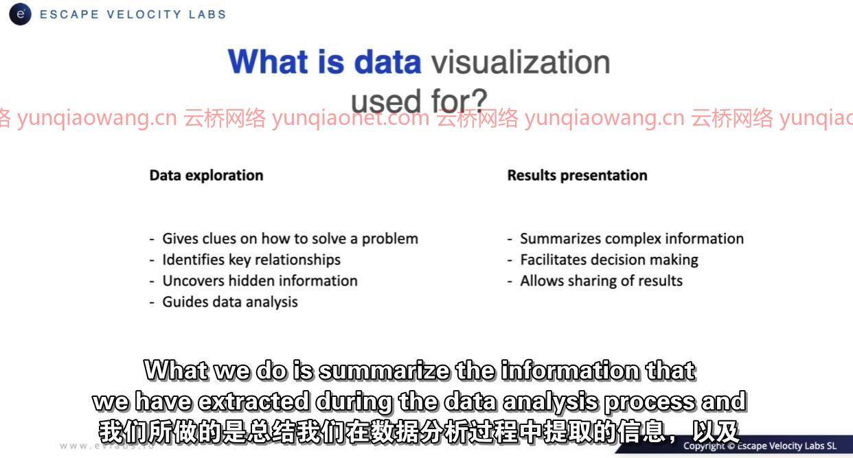
在本课程中,您将探索8个不同的数据集。你将通过构建各种图表,基本的和高级的,来学习理解他们的内容和回答问题。这是一项基本的数据科学技能,因为数据科学专业人员会分析和建模数据,以帮助决策和解决复杂问题。数据可视化是这个过程的一个基本部分,它指导数据科学家的分析,并以不同背景的人都能理解的方式呈现结果。
为了呈现结果,我们将创建一个带有plotly库的web界面,该界面将实时显示网页的最相关信息:访问、用户类型、会话持续时间、购买等。
在课程结束时,您将熟练掌握所有这些工具,并且能够直观地分析您自己的数据集并从中提取最相关的信息。
这门课是给谁的
有志于掌握这一基本技能的数据科学家。
希望学习如何从数据中发现相关信息的数据分析师。
需要向第三方直观传达复杂数据的专业人员。
希望直观呈现复杂信息的编程、科学或商业领域的学生。

Data Visualization in Python (2021)
MP4 | Video: h264, 1280×720 | Audio: AAC, 44.1 KHz, 2 Ch
Genre: eLearning | Language: English + srt | Duration: 59 lectures (3h 29m) | Size: 1.1 GB
Master this fundamental skill of data science in Python with the matplotlib, seaborn, plotly and dash libraries
What you’ll learn:
Explore data sets visually in Python.
Create web interfaces to visually present results.
Master the most important Python data visualization libraries (matplotlib, seaborn, plotly and dash).
Synthesize data sets for presentation to non-technical audiences.
Requirements
Very basic Python knowledge.
Description
IMPORTANT: the course is in BETA phase and we will add the missing lectures in the next few days/weeks. Please make sure this does not affect your learning plans. Thank you.
Learn how to synthesize complex data sets easily in a visual way. In this course, you will develop this basic data science skill by exploring real data sets with the most popular Python tools (matplotlib, seaborn, plotly, and dash). You will learn how to extract the most relevant information from data and present it with a variety of graphs and charts to non-technical people.
Learn how to extract visual knowledge from complex data for decision-making with Python.
– Master the main visualization libraries in Python for Data Science.
– Discover and extract the most important knowledge from complex data.
– Learn to build web interfaces with charts to present important results to a wider audience.
Master a basic data science skill.
In the course, you will explore 8 different datasets. You will learn to understand their content and answer questions by building a variety of graphs, basic and advanced. This is a basic data science skill as data science professionals analyze and model data to assist decision-making and solve complex problems. Data visualization is a fundamental part of this process, guiding the data scientist’s analysis and presenting the results in a way that people with diverse profiles can understand.
For the presentation of results, we will create a web interface with the plotly library that will show in real-time the most relevant information of a web page: visits, user types, session duration, purchases, etc.
At the end of the course, you will master all these tools fluently and will be able to visually analyze your own datasets and extract the most relevant information from them.
Who this course is for
Aspiring data scientists who want to master this fundamental skill.
Data analysts who want to learn how to discover relevant information from data.
Professionals who need to communicate complex data visually to third parties.
Students in the areas of programming, science or business who want to present complex information visually.
云桥网络 为三维动画制作,游戏开发员、影视特效师等CG艺术家提供视频教程素材资源!
1、登录后,打赏30元成为VIP会员,全站资源免费获取!
2、资源默认为百度网盘链接,请用浏览器打开输入提取码不要有多余空格,如无法获取 请联系微信 yunqiaonet 补发。
3、分卷压缩包资源 需全部下载后解压第一个压缩包即可,下载过程不要强制中断 建议用winrar解压或360解压缩软件解压!
4、云桥网络平台所发布资源仅供用户自学自用,用户需以学习为目的,按需下载,严禁批量采集搬运共享资源等行为,望知悉!!!
5、云桥网络-CG数字艺术学习与资源分享平台,感谢您的赞赏与支持!平台所收取打赏费用仅作为平台服务器租赁及人员维护资金 费用不为素材本身费用,望理解知悉!